Prior to coming to Solent, I was asked to attend an interview in order to achieve a place here. For the interview I prepared a portfolio that showed how the topics that I was studying at the time and the subjects that I had studied in lower years of work, would help me in the years to come if I were to gain a place here. This self assessment was somewhat accurate, however, I have been able to put my skills into practice since this point in time and have come to find in more detail which of them I can apply to my studies here and those that I could really do with improving upon.
At A-level I was studying Psychology, Business, Sociology and Textiles. I initially thought that the skills I had gained during my study in the first three subjects wouldn't be of any use for this course, however the essay structuring and writing that I put into practice over the past two years has already been helpful when writing reviews as well as writing my blog during the past couple of weeks.
Furthermore, I put these techniques to use while writing about my thought process when creating pieces of work for my portfolio based on the artist Andy Warhol, who's work I studied at GCSE. I was able to analyse his work and interpret it myself, using different mediums and my own style.
This is another skill that I have realised will definitely be useful to me in the future, as I will be looking at other photographers work and need to understand or interpret for myself what the designer and photographer were trying to portray through the image in order to maybe replicate a similar style. Here is the piece that I wrote for my portfolio earlier this year:
After going to the Tate Gallery in Liverpool the artist whose work intrigued me the most was that of Andy Warhol. Through the use of silk screening Warhol created a number of pieces that inspired me; his Marilyn Monroe pop art piece being the most striking. By layering different complimentary colours he created a piece that he describes as ‘strong, giving more of an assembly line effect.’ I was interested to find out whether I was able to create a similar piece using the same concept. I began by playing around with different colours and studying a colour wheel, this gave me the basic knowledge of what colours complement each other and which are contrasting. I wanted to achieve a piece that looked as similar to Warhol’s work as possible but with a modern twist, however I did not have access to print screen facilities or tools so I decided that seeing as modern was what I was trying to portray, modern technology was what I was going to use. I began by finding myself an image of someone in a similar role to that of Marilyn Monroe in her era, a strong, talented, well known and respected female role model; therefore I chose Madonna. But her similar personality traits are not the only reason why Madonna was my choice of model for this piece. Her style I found was much alike Marilyn’s with minor changes suited to the 70’s trends. She wears the same curled blonde hair, beauty mark, ruby red lips. I used a Photoshop tool in order to change the colours of the image and isolate the light and dark shades in the picture making it look like Andy’s work.

Other pieces that caught my attention were the images he produced of Elizabeth Taylor and Elvis Presley. He used a similar technique to that he used when producing the silk screenings of Marilyn but using less block colour. Instead he isolated the shadows from the image and then layered in colour underneath or in some cases just used the isolated shadow alone. I tried to create similar pieces using a number of different methods; I found that holding up an image printed onto a normal piece of cartridge paper I was able to see the shadows and dark spots of an image much easier, making it quite a simple task for me to create a template to work from. I played around with both matte and gloss acrylic with and without a colour. For the few coloured pieces I did I used both ink and water colour. The large piece that I created using a template and layering sponged watercolour over a template I thought looked a lot like the work of

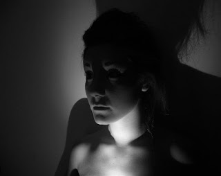
 Chiaroscuro is the treatment of light and shade in artwork. I was fascinated by the Chiaroscuro photography of Rankin. His work has been used for some of the biggest brands and publications and he has shot various covers for fashion magazine such as Elle and German Vogue for example. One of the images I found of Rankin’s that spoke to me most I have replicated in a large piece using pencil drawing and a wash over wax. The image was taken for a spread advertising Rebellips which shows a photograph of a beautiful woman torn in half to reveal a bare human skull. The message that I took from this photograph was
After doing this piece I thought I should play around with a variety of materials. I used some of the same materials I had used on my Andy Warhol work such as water colour and kohl for example; however I used different methods in order to portray a softer and more natural look like in the photography I was basing my work on. After completing various pieces based on the work of numerous different chiaroscuro photographers and artists such as Edvard Munch and Angelo

Pannetta, I decided to use a completely different medium; photography. I was interested to see first-hand how the light worked with the dark and how I could make it play off of the face and body in order to be able to portray this accurately in my art work. I had had very little experience using a DSLR camera before but from countless hours being engrossed watching Americas Next Top Model I knew what I was doing in front of the camera at least. I started by modelling myself and using the self-timer feature on the DSLR. Although I liked the way a lot of the photos turned out I found that it was difficult for me to see how the light moved being in front of the camera. Taking pictures of models helped my understanding develop a lot further as I was in control of the light and I was able to manipulate it to look the way that I wanted it to.
 This was the only written piece in my portfolio, as although I have quite a lot of experience in writing having taken numerous essay based subjects in the past two years of study, I felt that my art work was where my strengths and preferences lay and that my writing could use some improvement. Therefore, most of my portfolio consisted of images that I myself had created or shot.
 Furthermore, my retouching and image editing ability is very basic and I knew before coming here that the low level of skill I have in this area already needs more focus, especially for the field that I am trying to achieve work in.
 All of the images in my portfolio had no retouching done as I liked the look of the raw images and in all honesty I didn't really know where to begin in terms of retouching any of them.
 I worked with two different models on the shoots that I carried out for this unit and asked for their feedback on how they felt the images turned out, how comfortable they felt on the shoot and how well I was able to give them instruction on set. All of the feedback was very positive, mostly about my ability to communicate my ideas to them and what I was aiming to achieve from the shoot. This is an attribute that I thought would be vaguely applicable on the course but since creating my portfolio and during the two weeks I've spent here I have realised that this is a skill that I will value over some others that I thought that may have been more important. For example, my previous experience in hair dressing, although I feel it has given me an upper hand in some practice, I felt previously that it would be a lot more useful than it has been so far as we are being taken back to basics and learning skills, often using different techniques than I'm used to.

I showed some of my hair styling work in my portfolio as I thought that it was beneficial to already have some experience in this area when going in to hair design as a degree.
For this part of my portfolio I showed some of the typical styles that I would be asked to do in the salon. As most of my clients were little girls due to the fact that I wasn't officially trained as a hair dresser or stylist they were quite basic and childish designs, mostly based on princess themed styles. The images that I drew besides the photos of my designs were how I would develop them to be more suited to different occasions, for example, editorial or bridal hair.
 Another piece that I completed for my portfolio tied in the experience I have in creating textile pieces with my passion for makeup and hair design. I showed the fashion designs that I created paired with a hair and makeup look suitable for each garment. I kept my looks simple, neutral and subtle because my inspiration was the Victoria's Secret fashion show. In this scenario the garment would be the main focus of the audience, rather than the makeup and hair styling, therefore I needed to keep the style natural in order to do this. My ability to understand how to create focus in my designs is a skill I believe I valued before starting this course and even more so now, having started to increase my knowledge in the subject.
Overall, I feel that my writing and my technological skills in photo editing and photography itself are my main focus for improvement this year. Obviously I will be improving other skills along the way such as my hair styling and makeup application abilities but I feel that I will be able to apply myself more efficiently having identified where my weaknesses lie and what aspects of my learning I really need to improve upon directly.
Pannetta, I decided to use a completely different medium; photography. I was interested to see first-hand how the light worked with the dark and how I could make it play off of the face and body in order to be able to portray this accurately in my art work. I had had very little experience using a DSLR camera before but from countless hours being engrossed watching Americas Next Top Model I knew what I was doing in front of the camera at least. I started by modelling myself and using the self-timer feature on the DSLR. Although I liked the way a lot of the photos turned out I found that it was difficult for me to see how the light moved being in front of the camera. Taking pictures of models helped my understanding develop a lot further as I was in control of the light and I was able to manipulate it to look the way that I wanted it to.
Finally, I created 3 pieces that I thought well portrayed all of my research, method and material trial and also skill, each showing the versatility of the light and shade.
 This was the only written piece in my portfolio, as although I have quite a lot of experience in writing having taken numerous essay based subjects in the past two years of study, I felt that my art work was where my strengths and preferences lay and that my writing could use some improvement. Therefore, most of my portfolio consisted of images that I myself had created or shot.
I have had very little experience in photography and have little to no knowledge of how to use most cameras but I feel that I am able to capture an impressive image when given assistance in the technological aspect of the shoot. I feel that I have an eye for creating the appropriate lighting having done quite a lot of research and replication of chiaroscuro art work in the past few years, however, my technical photography ability is something that I really need to improve on.
 Furthermore, my retouching and image editing ability is very basic and I knew before coming here that the low level of skill I have in this area already needs more focus, especially for the field that I am trying to achieve work in.
  All of the images in my portfolio had no retouching done as I liked the look of the raw images and in all honesty I didn't really know where to begin in terms of retouching any of them.
  I worked with two different models on the shoots that I carried out for this unit and asked for their feedback on how they felt the images turned out, how comfortable they felt on the shoot and how well I was able to give them instruction on set. All of the feedback was very positive, mostly about my ability to communicate my ideas to them and what I was aiming to achieve from the shoot. This is an attribute that I thought would be vaguely applicable on the course but since creating my portfolio and during the two weeks I've spent here I have realised that this is a skill that I will value over some others that I thought that may have been more important. For example, my previous experience in hair dressing, although I feel it has given me an upper hand in some practice, I felt previously that it would be a lot more useful than it has been so far as we are being taken back to basics and learning skills, often using different techniques than I'm used to.
 I showed some of my hair styling work in my portfolio as I thought that it was beneficial to already have some experience in this area when going in to hair design as a degree.
For this part of my portfolio I showed some of the typical styles that I would be asked to do in the salon. As most of my clients were little girls due to the fact that I wasn't officially trained as a hair dresser or stylist they were quite basic and childish designs, mostly based on princess themed styles. The images that I drew besides the photos of my designs were how I would develop them to be more suited to different occasions, for example, editorial or bridal hair.
Another piece that I completed for my portfolio tied in the experience I have in creating textile pieces with my passion for makeup and hair design. I showed the fashion designs that I created paired with a hair and makeup look suitable for each garment. I kept my looks simple, neutral and subtle because my inspiration was the Victoria's Secret fashion show. In this scenario the garment would be the main focus of the audience, rather than the makeup and hair styling, therefore I needed to keep the style natural in order to do this. My ability to understand how to create focus in my designs is a skill I believe I valued before starting this course and even more so now, having started to increase my knowledge in the subject. Overall, I feel that my writing and my technological skills in photo editing and photography itself are my main focus for improvement this year. Obviously I will be improving other skills along the way such as my hair styling and makeup application abilities but I feel that I will be able to apply myself more efficiently having identified where my weaknesses lie and what aspects of my learning I really need to improve upon directly.
No comments:
Post a Comment