Showing posts with label Practice. Show all posts

Sunday, 13 December 2015

Eye and Lip Look


During a practical with Sue we were shown how to create the perfect eye and lip look. We started by looking at eye shapes and how to assess what style of shadow is best for each eye shape. 

The products I used to create my perfect eye and lip look were: 


-Charles Fox Lipstick Palette 
-Mac Eye Shadow Pallet
-Rimmel Mascara
- MAC highlighter

Tools I used: 

-MAC medium shadow brush
-Charles Fox blending brush 
- Charles fox angled brush

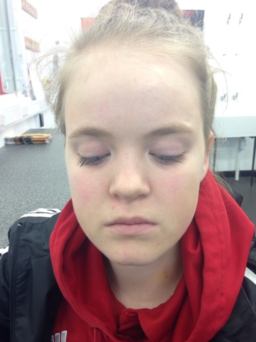
After cleansing, toning and moisturising I applied a normal foundation base that I have written step by step for in a separate post on this blog. My model had almond eyes which meant that I shouldn't apply shadow above the crease of the eye but instead pull it out farther than the outer corner to flatter the shape of the eye. I started by applying a nude shade all over the lid and then the lightest shade of brown to the crease. I used a Mac eye shadow brush for this as its a preference of mine, however any eyeshadow brush will do. I then applied the darker shades of brown to the outer corner of the eye and used my blending brush to bring this out just beneath the brow bone on the outer corner. This gave a gradient effect and was flattering to the almond eye shape. I used a Rimmel volumising mascara and a disposable mascara brush to tint my models upper and lower lashes. I then applied a small amount of MAC highlighter onto the brow bone and the inner corner of the eye. 

For the lips I used a small angle brush to line to brush some vaseline onto my models lips first in order to make the lip colour application smooth and even. I used a nude colour in order to keep the focus of the final look on the eyes on not on the lips as she had quite thin lips. 


I was very happy with the way this turned out and it is definitely a look that I will be doing on myself. My model seemed very pleased with the way she looked also and even wore it home! I didn't struggle with the application and I feel that I did really well.  

Saturday, 12 December 2015

Practice of my final design

I wanted to make sure I was using the correct products for my final design so I decided to practice on myself as I can almost alway rely on me to be there on time and on form. What I concluded having conducted this practice is that there was definitely an order in which it is best to do things.

Step 1 - Prep skin, apply primer and white base, buff out and apply translucent Illamasqua powder to set.

Step 2 - Use lightest shade of grey shadow to outline the heart shape on forehead and create the shading working into the darker shades of grey and black.

Step 3 - Use the supra colour to create the heart section on fore head and then fill in the brows.

Step 4 - Apply gold to the eyes and starting with the light grey shadow and graduating to the darker shades  contour the nose and cheek bones where the heart section will be on the cheeks

Step 5 - Apply the white supra colour to the lashes.

Step 6 - Colour in the section in-between the grey shadow that you created for the black Supra colour.

Step 7 - Add the gold to the lips and then line with the black, smudging in before drying.

Step 8 - Contour the chin with the grey shadows and then highlight with the mac highlighter powder on all white areas.


Practice of my partners design

In order to recreate my partners design perfectly I felt that it would be appropriate to practice it at least once. We had planned to have a whole hour and ten minutes to practice the design in order to see if i could do it under the time constraint that I would have in the final assessment, however we ended up with a lot less time due to a fire alarm. Because of this I thought that it would be better to practice doing half of the face than not practicing at all. I really liked my partners design and I thought that it would be quite interesting seeing if I could achieve he vision.


This practice gave me a lot of confidence as I was able to create a step by set guide for myself to follow when recreating the design again to ensure high quality of the final look. I was happy with the control that I was able to keep when under a time limit as well, which made me even more relaxed in the actual assessment which I feel contributed to the way I performed ultimately.  


Final Assessment Face Charts

These are the three face charts that I created for my final assessment.

The first design that I created I hadn't planned out before starting. I couldn't think of anything that was representative of the look I wanted to create for my lady in waiting so I just started with the base and created a design while I worked. I knew already that I wanted to use the colours black, green and gold as they all represent power and wealth, something the Bess of Hardwick strived for.

This first design turned out very understand because I didn't want to ruin it by doing something over the top and hating it because i hadn't planned and thought it through. Something that I didn't consider were the techniques that we had been shown during our practical lesson on elizabethan makeup, therefore it had next to no elements of elizabethan makeup within it, other than the colours. I wasn't impressed with this design, I though I was pleased with the overall finish of the chart itself.


That first face chart was a mistake and one that I apparently need to make as it influenced a lot of things that I did differently in this next one. I wanted to incorporate more classic elements of an elizabethan look while still making the whole design contemporary. I wanted to keep the base pale ut not white so i just created a very pale foundation and used the white base alone to contour around the eyes and on the cheek bones. I wanted the eyebrows to disappear so I used a royal maroon/plum colour shadow, continuing from the upper lid all the way onto the brow bone and covering the brow over so it looked as if the eye brows weren't there. I was then able to reposition where it looked like the eyebrow was entirely. I used the Illamasqua metal pallet to draw a line of gold in a lower position for the brow. I lined the eyes with white supra colour as well as whitening the lashes. I used MAC shimmer highlighter to add a dewey look to the cheeks bones and a pink blush to add colour to the apples of the cheeks. The lips I wanted to be an intense shade of gold lined with a sightly darker shade to create depth. I was really happy with the way this chart turned out, there is a better balance of both contemporary and classic elizabethan style within this design however it is not my final chosen design.


When planning this design I was really thinking about my lady in waiting and the story that I created for her. I wanted her to be pale as she is a cold hearted character in the end and because its a classic elizabethan style, therefore I used the Illamasqua white base for her face ears and neck.  I wanted to incorporate the colour gold into the chart somewhere and thought that her eyes would be the appropriate place to use this shade representing wealth and power as thats all she saw and all she strived for. I wanted the supra colour heart shape on her face to show how she had been damaged by the ones she loved and this is why I used solid lines in black for this part of my design.  I wanted it too look a little bit as though her face was sunken and dead and thats why I blended various shades of grey shadow around the edges of the heart shape in order create depth. I wanted her lips to be gold in the places that they would be highlighted normally, fading out into a black outline that meets the heart shape in the corners of her mouth. I wanted to keep the eyebrows large and contemporary, so I made them dark and thick using black supra colour as well as a black eye shadow. I finished the design off by contouring the face with MAC highlighter and a dark grey shadow from my Charles fox natural palette. I had thought through every little detail of this design and I was very pleased with the way it turned out in the end.


Practical - Halloween

During this practical session we changed our topic completely. We were no longer studying Elizabethan makeup, instead we were looking at Day of the Dead makeup. We were asked to work in partners and create a sugar skull style halloween makeup design on one another. We didn't have enough time to both create a look on each other so I was the model during this lesson and took it upon myself to create my own design at home in order to perfect my own Halloween look.

The products that I used for these looks are:

- Charles Fox Supra Colour Palette
- Illamasqua Translucent Powder
- Charles Fox Bright Eye Shadow Palette
- Charles Fox Natural Eye Shadow Palette


Practical - Basic Elizabethan Makeup

For this practical lesson we were shown how to create a very basic Elizabethan look. This will help us to understand some of the techniques that we could use in our designs that we could alter to be more contemporary or keep as a classic element. 

The products that I used: 

-Illamasqua white base
-Charles Fox Blush Pallet
-Charles Fox Lip Pallet
-Illamasqua Translusent powder
-Charles Fox Supra Colour

The tools that I used for this look: 

-Charles Fox Small Angled Brush
-Charles Fox Kabuki brush
-Disposable Mascara wand
-Charles Fox Large Powder Brush
-Charles Fox Stippling Brush

Like any other look that I have created and any that I will create in the future I started off by undertaking the necessary health and safety precautions which you will be able to see on any other practical post on my blog. I prepped the skin with cleanser, toner, moisturiser and a matte primer and then began applying the Illamasqua white base to my model. I applied it to the face, neck and ears using a stippling rush and then buffing it out, I find that the Illamasqua base looks best on the skin as well as being easier to apply. Before I applied the Illamasqua translucent base I used the white Supra colour to white out the eyebrows. I did this using a disposable mascara wand and brushing the hair against the grain first and then smoothing them out by brushing them in the correct direction. I then powdered the face and neck having covered the brows and skin white. I applied a bright pink blush from the Charles fox blush palette to the apples of the cheeks and as well as applying a small amount of lip colour from the Charles Fox lip palette to my mode lips. finally we used the white Charles Fox Supra colour and a disposable mascara wand to colour the top and bottom lashes white. 

Once we had done this, we were allowed to play around with the look ourselves, trying out different things to see how they would turn out. I used the dark red and pink Supra colour on the brows to try and create an ombre brow. I think it looked quite effective however I don't think it is something that I will be using in my final design. I also used the supra colour on the cheeks, pivoting my brush over the blusher to make the cheeks more prominent. This did not look good at all, my model looked like the puppet form the SAW movies not like an elizabethan. 


I enjoyed this session as it gave us some inspiration as well as an opportunity to play around with our makeup kits in order to understand the effects that certain products will have when on a real person and not just a face chart. 

Practical - The Perfect Base

In our latest couple of practical session with Sue we were shown how to create the perfect base for a natural makeup look. I set up my work station by placing each roll over the mirror shelf and laying out all of the products and brushes that I would need for todays lesson and turning on the mirror lights. Once we had tied our models hair back and given them a gown to wear we washed our hands and began by cleansing, toning and moisturising the face and neck. I asked my model if she was wearing contact lenses or if she had any allergies and I was ready to go. 

The products we used to create this look were:

-Illamasqua Matt Finish primer
-Charles Fox Foundation Palette 
-Charles Fox Contour Powder Palette 
-Illamasqua Translucent Powder
-Charles Fox Concealer Pallet
-Mac Shimmer Highlighter
-Illamasqua White Base

The brushes that I used were:

-Charles Fox stippling brush 
-Charles fox Small Rounded Eyeshadow Brush (most small shadow brushes will work)
-Illamasqua Powered Puff
-Charles Fox Kabuki brush 


Once the skin has been prepped properly, you should begin by applying the Illamasqua satin or matte primer. this depends on the skin the of your model as well as the look you are trying to achieve. If you model has naturally very oily skin then the matte primer is probably better to use as it wont add to the grease that will form on the face. The primer allows the foundation to set on the skin and it won’t allow it to move around during the day, making it last longer. You can apply the primer with your hands like you did with the moisturiser, however it is probably best to use a stippling brush to apply this to get more even coverage and to make your model feel more comfortable also. Not only this but the rush will be moist and will take the foundation a lot easier if it has been used to apply the foundation. Once the face and neck have been primed you will need to mix the correct colour of foundation for your model. Using a wooden spatula you should scrap a small amount of an appropriate foundation out of the palette and apply it to the back of your clean hand. If you need to add other colours or any of the Illamasqua white base then you can do so, mixing it again on the back of your hand. Test this colour by applying a single brush stroke onto your models jaw line and down her neck. If you need to make alterations then do so, if not then you will use the foundation that you mixed on your hand to cover the whole face.   

Apply the foundation using the same stippling brush you used to apply the primer, working from the middle of the face and pulling the foundation out. This brush will not create completely streak free finish, so don’t worry about lines in your foundation just yet. You ill need to remember to keep checking you application in the mirror as well as looking at it yourself to avoid any uneveness. Taking the Kabuki brush, you will brush the whole face in small circular motions buff the foundation into the skin. I found that I had lines in my foundation despite me taking a long time trying to get this perfect, but once I had buffed the face my application was flawless and I was very happy with the result. Something that I feel I should add, is that when buffing the face, you are supposed to buff the foundation on the eyelids however you should take into consideration that you will need to be a more careful around this area. When I was being used as a model, during this part of the application, I had a lot of my lashes torn out as they got caught in the brush and this is something that i am very aware of now when working on my models. 


When you have perfected your foundation, you will need to start mixing the correct colour of concealer for your models skin tone. It will need to be 1-2 shades lighter than their foundation in order to have the desired effect. I used numerous colours from the Charles Fox concealer palette in oder to create a match with my models skin, again mixing it on the back of had but applying it with  a small shadow brush rather than the stippler brush. I applied it to any blemishes that I was able to see and also underneath the eyes. I again took the Kabuki brush and blended the concealer into the skin to avoid having any tide lined been your foundation and concealer. To set all of this grease base product, you will need to use a powder all over your models face and neck. The product that I used was the Illamasqua translucent powder because it is colourless and won’t have any visual effect on what I have done so far. I applied it using a power puff, dipping it into the powder and applying it to the face, pressing and rolling the sponge on the skin. 


Finally, we need to contour the face and this means finding the correct places to contour. Ask your model to suck her cheeks inwards so that you’re able to see her cheek bones, gentle feel for the underneath of her bone and draw a faint line to mark this out using the Charles Fox Contour Powder Palette and a small shadow brush. This are needs to be slightly darer than the rest of the face, and so does the tip of the nose, underneath the bottom lip, around the hair line on the forehead and just before the temple on the bone. This needs to be very subtle and blended well, a tip for doing good contouring is to try and make it look like you haven't contoured at all. I finished my look off by applying my favourite highlighter by MAC to the top of the cheek bones and the under neath of the eye socket as well as adding a small amount on the bridge of the nose. 


I was surprised at how much difference expensive products, tool and professional lighting can make to the finish of a look and was pleased with my work today. there was nothing that I really struggled with other than finding he correct colour of foundation for my model, which I managed to do in the end. 

Colour Theory Facecharts

Having had a session with Kat about colour theory and the colour wheel I have created three different colour theory looks on face charts below.

Anagulous and Monochromatic:


Complimentary:


In a lesson that we had with Sue we were given the opportunity to practice an anagulous, monochromatic or complimentary look on a model of our choice. At this point in time I had created both my my monochromatic and complimentary face charts but I hadn't yet done designed a look using anagulous colours, so I decided to challenge myself to come up with an anagulous look when put under pressure. I created a base using the Illamasqua white base and set it with the Illamasqua transparent powder. I then moved onto her eyes and by this point I had decided that I wanted to use greens and yellows to make up this look. I started at the inner corner of the eye using the yellow from the Kryolan Bright eye shadow palette and worked it out to the outer corner. I then took the lighter shades of green and worked them out starting from a reference point that was further from the inner corner of the eye each time. This created an ombre look on my models eyes, starting with the lighter shades at the inner corner of the eye and gradually becoming a different shade in the out corner of the eye. I was happy with the design itself but my execution wasn't perfect. I felt that I wanted to add something to this design and thought it might be effective to contour the face using colours that matched the eyes as normal colours for contour being pace on top of the white would have created a more complimentary look. I used yellows again to begin with on the cheeks, working darker shades under the cheek bones to create depth. I took various shades of green from the hairline down onto the forehead fading out and blending into the base. Finally I took the gold from the Kryolan Supra Colour palette and lined the eyes with this to add some sparkle and vibrancy. I was happy with the way that I applied these final touches as well as the over all look, I feel that I rushed the eyes as I didn't want to run out of time and have only half of my models makeup finished which left me with a lot of time.


Friday, 11 December 2015

Practical - Cleansing and Toning

In our first practical lesson with Sue Mainstone we were spoken to about the importance of health and safety and all of the measures that need to be taken before applying makeup on our models. These steps should be take each and every time we work on an individual, whether we have worked with them before or not. A lot of things that needed to be taken into account were very basic and probably should be something that we do each time we enter any classroom or working area. Firstly, bags and coats need to be placed on hooks, off of the floor and out of the way, this will prevent people tripping and getting injured and equipment getting damaged. Even when working on a set that you are unfamiliar with this is something that is so easy to do and will put a stop to some potentially serious accidents happening, especially when you will be working in quite a busy and rushed environment at sometimes. Not just coats and bags, all culture should be cleared from he floor in order to remove any and all hazards. 

Another health issue that could occur when working so closely with people is unclean and unhygienic equipment. Everything should be cleaned to a standard that you would be happy using it on yourself. All brushes should have been washed in alcohol and be completely dry prior to their last use. Washing them straight after each use is an easy way to keep track of which brushes are clean and which aren’t, as they will all be clean when packed away.

Furthermore, your model will need to have all hair off of their face. This means that it won’t get in the way of your work and you wont get an products in their hair that shouldn't be there. Especially if you are working on model who has already had their hair styled, getting makeup in their hair could cause issues on set that would be your responsibility.  

Finally, you will need to make sure you, yourself are clean. Before placing a hand on your model, you will need to wash your hands and let them know that you are going to do so. This will ensure them that you are concerned with their well being and they will feel a lot more comfortable in your hygienic hands. Something else that needs to be considered is that if you smoke you will need to pay a lot of attention to covering the smell of smoke from your being, equally its not a good idea to over do it with strong perfumes and deodorants as this could be quite over bearing for your client, preventing them from returning to you as an artist.


After the above steps have been followed there are a few things that you will need to find out from your model before applying any product to their face or body. Its very important to ask whether they are allergic to anything in order to avoid them having any form of reaction to products you plan on using. If they have a severe reaction you could be held accountable and also this will be devastating for your reputation. In addition you will need ask them if they wear contact lenses. If so, you will need to be a lot more careful with products, especially powders, around their eyes as they could become irritated.

Finally, you will be able to start working on your model. Even if you model appears to have no makeup on their face, you should begin every session by cleansing their face. This is done by using cleaning lotion and a cotton pad (having made sure your model isn't allergic to this prior). The lotion that we use is for sensitive skin so its appropriate for almost all skin types, and using this lotion we were to wipe the whole face starting from the neck and using upward motions to remove any excess makeup. This sounds like a very basic task however this has to be done from behind your model and using the mirror as reference. If that wasn't hard enough, its better to use both hands to cleanse the face as its quicker and more thorough. Trying to work out where both hand are going by watching yourself in the mirror as well as considering the amount of pressure to use all at the same time is hard in all honesty. I struggled with this the first time I did it and although my model ensured me that she was fine and that I was doing ‘so well’ I could see the fear in her eyes. In hind sight I probably shouldn't have been looking at her eyes as this is where my hands began to move to quite quickly.  We don't use the cotton pads to remove makeup from he eyes instead we use cleanser on a cotton bud asking the model to look up and down when working on her upper or lower eye area. This removes makeup at much slower pace but with a lot more control, when cleaning this part of the face its recommend not to use both hands at the same time.
When the cotton pads/ buds were making contact with the face and coming away clear then we were to move onto toning the skin. Toner is used in the same way as the cleanser but avoiding the eyes. Toning removes anything that may have been left on the skin when cleansing and also preps the face ready for moisturising. When moisturising the face, you are to use your hands with a small amount of moisturiser applied, massaging the face in circular motions. Again, you were to stand behind you model and use the mirror as reference. This was easier than cleansing the skin as I was able to feel for myself where my hands were on the face as well as seeing it in the mirror, despite this my model still looked terrified rather than relaxed as though she was about to get a facial from Edward Scissor hands.  She still ensured me that I was doing a good job and that she was ‘honestly fine’ but having worked with her since and improving my cleaning and toning skills I can confirm she was not entirely fine this first time.    

After completing the preparation of your models face you are able to move onto applying makeup appropriate for their skin type, tone and your brief.

Elizabethan Makeup Ingredients

Elizabethans considered a pale complexion to be be not only a sign of wealth but also a sign of good health. This is because poor women would be tanned from working outdoors doing manual labour, whereas the richer women who didn't have to work would have very pale skin as they often stayed indoors or under shelter when in a situation that they would have to be in the sun. If richer women were not blessed with a pale skin tone then they would use various different things to make their skin look white. One of the most common ingredients used to achieve this look was Ceruse, which is a foundation type makeup that was make up of a mixture of poisonous white lead and vinegar. Some women preferred to use sulphur, tin ash or alum. Mother of pearl were used by the richest of the rich, ground up to give a luminescence and shimmer. White eggs were also used to achieve this paler complexion but mostly as a method of hiding wrinkles. Its not only today that we see wrinkles and blemishes an issue, this is something the stretches all the way to Elizabethan times meaning both women and men during the tudor period used various different concoctions to prevent these problems form occurring.

Quite like today, the amount of makeup we wear contributes to the amount of blemishes that we get, however in Elizabethan times this was taken to a different extreme.  All of the makeup men and women used in order to achieve a perfect white complexion, would often be the root of all types of skin problems. The ingredients wouldn't just leave the skin dry and covered in blemishes it would often burn the skin causing lesions that were itchy and flaky which would only take more and more makeup to cover.  To remove blemishes, wrinkles, spots and freckles the Elizabethans would use ingredients such as rosewater, lemon juice or mixtures of eggshells, alum, mercury and honey. The wealthy would also bathe in goats and donkeys milk.


Women used black kohl to rim their eyes and make them look darker as well as Belladonna, which enlarges pupils so that eyes look larger and sparkly. Belladonna is often called the devils berry or deadly nightshade due to the fact that Belladonna’s so toxic even eating a small quantity of its leaves or berries can be fatal to humans, particularly children, and some animals. Simply touching the leaves can irritate your skin. No pain no gain I suppose.

 Eyebrows were trimmed to be thin and highly arched creating the illusion of a higher forehead. Some women wold pluck their eyebrows completely out in order to achieve this look. Cheek and lips were often altered to look rosy rouge and to achieve this women would use various plants and animal dyes. It was common for women to use madder; an Asian plant with red roots to tint the lips and crushed cochineal beetle on the cheeks. There were various other ways of achieving this look, one using a mixture of egg whites and ochres; a natural earth pigment containing hydrated iron oxide. All of the ingredients used above could be reddened further by using vermillion which is a red pigment obtained from mercury sulphide.


Having been given the task of finding and making my own Elizabethan makeup using the same ingredients that would have been used during the Tudors, I had decided after doing this research that even if I did manage to get hold of all of the ingredients to create one of my own, I definitely wouldn't be applying it.  My skin is in poor enough condition on its own without me slapping white lead and vinegar all over it. I had considered for a small time bathing in goats milk, however I don't have a goat nor do I have a bath so it was out of the question, the best I could have done is semi skimmed cows milk in the shower and I didn't think it would have had the same effect. However, I have actually tried one of the Elizabethan skin care recipes before now even prior to doing this research. Egg whites are still an ingredient that is considered helpful when trying to improve the clarity of skin. Obviously we now have a lot more information that has lead to the introduction of genuinely helpful products, however they are rather a lot more expensive than a box of six free range eggs.


The ingredients I used to try and help clear my skin where egg whites, lemon juice and sugar. The original Elizabethan recipe uses egg shells rather than sugar but at the time I didn't know about this, nor am I willing to try it again with eggs shells as I don’t want to cut my face off in order to see how the Elizabethans lived.  As you can imagine the mixture had a very strange consistency, its was what I imagine it would feel like if you tried to apply really watery unset jelly to your face. The sugar was for exfoliating purposes and it actually felt no different to using a store bought exfoliant. I left the mixture to set on my face and it was quite refreshing at first, not to mention it tasted delightful, however nearing the end of the time i was instructed to leave it on for the mask began to become very very sticky making my face feel quite taut.

The results of the mask never really became apparent which makes me think that it doesn't really work and that its a method that should be left in Elizabethan times. I only did this once a day for a week so maybe it works with more constant use but from what I could tell, it wasn't really having any effect on my complexion and if it was then the results were that minor that it wasn't worth the time, effort and stickiness.


Tuesday, 6 October 2015

Self Assessment

Over the past couple of weeks I have come to realise which of the practical and academic skills that I currently possess that may come to help me in my work over the next three years. I have also been able to highlight those which I previously thought would be a lot more use than they actually have been so far. Whether I will be able to utilise them in the future I am yet to find out.


Prior to coming to Solent, I was asked to attend an interview in order to achieve a place here. For the interview I prepared a portfolio that showed how the topics that I was studying at the time and the subjects that I had studied in lower years of work, would help me in the years to come if I were to gain a place here. This self assessment was somewhat accurate, however, I have been able to put my skills into practice since this point in time and have come to find in more detail which of them I can apply to my studies here and those that I could really do with improving upon.


At A-level I was studying Psychology, Business, Sociology and Textiles. I initially thought that the skills I had gained during my study in the first three subjects wouldn't be of any use for this course, however the essay structuring and writing that I put into practice over the past two years has already been helpful when writing reviews as well as writing my blog during the past couple of weeks.
Furthermore, I put these techniques to use while writing about my thought process when creating pieces of work for my portfolio based on the artist Andy Warhol, who's work I studied at GCSE. I was able to analyse his work and interpret it myself, using different mediums and my own style.
This is another skill that I have realised will definitely be useful to me in the future, as I will be looking at other photographers work and need to understand or interpret for myself what the designer and photographer were trying to portray through the image in order to maybe replicate a similar style. Here is the piece that I wrote for my portfolio earlier this year:


After going to the Tate Gallery in Liverpool the artist whose work intrigued me the most was that of Andy Warhol. Through the use of silk screening Warhol created a number of pieces that inspired me; his Marilyn Monroe pop art piece being the most striking. By layering different complimentary colours he created a piece that he describes as ‘strong, giving more of an assembly line effect.’ I was interested to find out whether I was able to create a similar piece using the same concept. I began by playing around with different colours and studying a colour wheel, this gave me the basic knowledge of what colours complement each other and which are contrasting. I wanted to achieve a piece that looked as similar to Warhol’s work as possible but with a modern twist, however I did not have access to print screen facilities or tools so I decided that seeing as modern was what I was trying to portray, modern technology was what I was going to use. I began by finding myself an image of someone in a similar role to that of Marilyn Monroe in her era, a strong, talented, well known and respected female role model; therefore I chose Madonna. But her similar personality traits are not the only reason why Madonna was my choice of model for this piece. Her style I found was much alike Marilyn’s with minor changes suited to the 70’s trends. She wears the same curled blonde hair, beauty mark, ruby red lips. I used a Photoshop tool in order to change the colours of the image and isolate the light and dark shades in the picture making it look like Andy’s work.   

Other pieces that caught my attention were the images he produced of Elizabeth Taylor and Elvis Presley. He used a similar technique to that he used when producing the silk screenings of Marilyn but using less block colour. Instead he isolated the shadows from the image and then layered in colour underneath or in some cases just used the isolated shadow alone.  I tried to create similar pieces using a number of different methods; I found that holding up an image printed onto a normal piece of cartridge paper I was able to see the shadows and dark spots of an image much easier, making it quite a simple task for me to create a template to work from. I played around with both matte and gloss acrylic with and without a colour. For the few coloured pieces I did I used both ink and water colour. The large piece that I created using a template and layering sponged watercolour over a template I thought looked a lot like the work of
Michael Murphy. Although both materials create a washed out look I preferred the impact of black over white and how strong and clean the contrast in shade made the image look, because of this I continued to work without colour for numerous pieces.  The final image that I worked on in the style of Andy Warhol was using a black kohl pencil. The method itself made me wonder about shadows. The way that the kohl smudged giving both harsh, dark lines and soft, lighter lines made me think about shadows and the way they can be harsh and soft, how they can make things seem different from our view of reality. Up until this point I had only been working with shadows in a very basic way and my work although accurately portraying Andy Warhol began to seem very flat. I decided from this to research into artwork related to and working with shadow and light play.


Chiaroscuro is the treatment of light and shade in artwork. I was fascinated by the Chiaroscuro photography of Rankin. His work has been used for some of the biggest brands and publications and he has shot various covers for fashion magazine such as Elle and German Vogue for example.  One of the images I found of Rankin’s that spoke to me most I have replicated in a large piece using pencil drawing and a wash over wax. The image was taken for a spread advertising Rebellips which shows a photograph of a beautiful woman torn in half to reveal a bare human skull. The message that I took from this photograph was
that beauty is only skin deep and that we are only what we make ourselves. Everyone would look the same if our ‘masks’ were to be torn back like the image shows. It showed such beauty next to something that most would consider grotesque, however both of the same thing, the same person.  I used soft and smudged pencil lines to portray the delicate, soft and pretty lines of the woman’s face; I paired this method with the use of a wax base with a teabag wash. This gave a discoloured and grim look to the skull helping me show the imperfection of the bone in contrast with the flawlessness of the models skin side by side. 


After doing this piece I thought I should play around with a variety of materials. I used some of the same materials I had used on my Andy Warhol work such as water colour and kohl for example; however I used different methods in order to portray a softer and more natural look like in the photography I was basing my work on. After completing various pieces based on the work of numerous different chiaroscuro photographers and artists such as Edvard Munch and Angelo

Pannetta,  I decided to use a completely different medium; photography. I was interested to see first-hand how the light worked with the dark and how I could make it play off of the face and body in order to be able to portray this accurately in my art work.  I had had very little experience using a DSLR camera before but from countless hours being engrossed watching Americas Next Top Model I knew what I was doing in front of the camera at least.  I started by modelling myself and using the self-timer feature on the DSLR. Although I liked the way a lot of the photos turned out I found that it was difficult for me to see how the light moved being in front of the camera. Taking pictures of models helped my understanding develop a lot further as I was in control of the light and I was able to manipulate it to look the way that I wanted it to.

Finally, I created 3 pieces that I thought well portrayed all of my research, method and material trial and also skill, each showing the versatility of the light and shade.
This was the only written piece in my portfolio, as although I have quite a lot of experience in writing having taken numerous essay based subjects in the past two years of study, I felt that my art work was where my strengths and preferences lay and that my writing could use some improvement. Therefore, most of my portfolio consisted of images that I myself had created or shot. 
I have had very little experience in photography and have little to no knowledge of how to use most cameras but I feel that I am able to capture an impressive image when given assistance in the technological aspect of the shoot. I feel that I have an eye for creating the appropriate lighting having done quite a lot of research and replication of chiaroscuro art work in the past few years, however, my technical photography ability is something that I really need to improve on.
Furthermore, my retouching and image editing ability is very basic and I knew before coming here that the low level of skill I have in this area already needs more focus, especially for the field that I am trying to achieve work in. 
All of the images in my portfolio had no retouching done as I liked the look of the raw images and in all honesty I didn't really know where to begin in terms of retouching any of them.
 I worked with two different models on the shoots that I carried out for this unit and asked for their feedback on how they felt the images turned out, how comfortable they felt on the shoot and how well I was able to give them instruction on set. All of the feedback was very positive, mostly about my ability to communicate my ideas to them and what I was aiming to achieve from the shoot. This is an attribute that I thought would be vaguely applicable on the course but since creating my portfolio and during the two weeks I've spent here I have realised that this is a skill that I will value over some others that I thought that may have been more important. For example, my previous experience in hair dressing, although I feel it has given me an upper hand in some practice, I felt previously that it would be a lot more useful than it has been so far as we are being taken back to basics and learning skills, often using different techniques than I'm used to.

I showed some of my hair styling work in my portfolio as I thought that it was beneficial to already have some experience in this area when going in to hair design as a degree.

For this part of my portfolio I showed some of the typical styles that I would be asked to do in the salon. As most of my clients were little girls due to the fact that I wasn't officially trained as a hair dresser or stylist they were quite basic and childish designs, mostly based on princess themed styles. The images that I drew besides the photos of my designs were how I would develop them to be more suited to different occasions, for example, editorial or bridal hair.

Another piece that I completed for my portfolio tied in the experience I have in creating textile pieces with my passion for makeup and hair design. I showed the fashion designs that I created paired with a hair and makeup look suitable for each garment. I kept my looks  simple, neutral and subtle because my inspiration was the Victoria's Secret fashion show. In this scenario the garment would be the main focus of the audience, rather than the makeup and hair styling, therefore I needed to keep the style natural in order to do this. My ability to understand how to create focus in my designs is a skill I believe I valued before starting this course and even more so now, having started to increase my knowledge in the subject.

Overall, I feel that my writing and my technological skills in photo editing and photography itself are my main focus for improvement this year. Obviously I will be improving other skills along the way such as my hair styling and makeup application abilities but I feel that I will be able to apply myself more efficiently having identified where my weaknesses lie and what aspects of my learning I really need to improve upon directly.

Thursday, 24 September 2015

My Freshers Week

My first week down in Southampton was quite the adventure, almost every task I was undertaking was challenging me on various different mediums. During this week I was very rarely in a position where I considered myself within my comfort zone, consistently being pushed to be innovative and independent in areas that are mostly alien to me personally. Despite the fact that I was surround by people in exactly the same situation as me, I cant say that it made things a whole lot less intimidating, especially when presented with an independent task with little to no time for preparation. Planning ahead is something that I have realised I took for granted in my lower levels of study during this first week and that over this short time I have come to the conclusion that working with out preparation is not playing to my strengths. However, I still think that I gave this first weeks tasks my best shot and provided impressive outcomes under the circumstances.
Despite it not being what I'm used to and feeling thrown in at the deep end, it doesn't mean that I didn't have fun, I actually had an incredible first week at Solent.

Mood Board

The first task that I completed for induction week was done over the last few weeks of summer. This obviously gave me time to plan what I was hoping to achieve as well as the time necessary to carry it out, which allowed me to produce a piece that I was confident in portraying what I intended it to. We were set the task of creating a mood board that represented where we wanted to be in 5 years time. We shared these mood boards within our groups in one of the first sessions, and I found it interesting to see what different people were aiming to achieve from their time at university and how much it varied from person to person.

My mood board shows my current indecisiveness towards my future career. There are numerous  different aspects of media hair and makeup styling that I currently would like to explore and find my likes, dislikes, strengths and weaknesses in. I like the idea of doing beauty work in editorial magazines or behind the scenes on runways, as well as having a strong interest in film and theatre makeup and hair design. I also aspire to maybe have my own make up line one day in the future and be an independent business owner. Until I have experienced working in all of these aspects of hair and makeup then I don't feel I will know for sure which of these career paths I would like to take, which is exactly why I'm here and what I'm aiming to learn.


My mood board drawing
I drew an image for this mood board as its something that I enjoy doing and that I feel is a strength of mine, also its something that I can manipulate to be specific to my portrayal. Each aspect of the drawing represents an area in which I would like to work in the future. The prosthetic ear in the piece represents film and theatre work, the big hair and her makeup represent my aspirations to work in these two fields whether it be as an artist and designer or a business owner. The other pictures I compiled were all related to the career paths that I intend to explore in the future, I found these in magazines such as Elle and Vogue and others I gathered from the internet.
Having taken a small trip to the library in the first few days of my arrival, I found that the it is most likely going to be one of my major sources of knowledge from this point onwards. Its a lot more reliable than I find the internet to be and it held a surprisingly large amount of information on various different areas of the topic at study and I intend to utilise these resources.

Style Review

As well as our mood boards we were asked to analyse the styling of one iconic film from a long list provided. The film that I chose to review was The Great Gatsby (2013). It was only a few months prior to writing this review that I had seen the film and fallen in love with the aesthetic of it. Yet I found this task quite difficult to carry out, as writing is not one of my strong points as I am sure you will come to learn from my blog. One of my biggest weaknesses being that I tend to concentrate on issues that aren't always particularly important, for example I feel as though I didn't pay enough attention to the impact of the styling of the hair and makeup for this review, which was the main focus of the brief. However, being capped at 300 words for this review was overall helpful to me although it being quite a challenge. It forced me to cut out some of the information that wasn't specific to the point that I intended to make. I feel that continuing to analyse books, films and images in future, as well as reading other peoples reviews, I will develop my writing skills and become more precise, as this is something that I feel I need to focus on.


The Great Gatsby – 2013 

The plot of ‘The Great Gatsby’ portrays both drama and romance, making it fall under both genres in my opinion. After numerous failed attempts of portraying the book through film in 1926, 1949, 1974 and 2002, the 2013 depiction was the first to do so successfully, winning various awards and making this film so iconic. Catherine Martin was the costume designer for ‘The Great Gatsby’ who won awards for her work on the production, alongside Maurizio Silivi and Kerry Warn; hair and makeup artists who won BAFTA’s for being best in their fields.

The heavily beaded, nude flapper dress that Adelaide Clemens (Catherine) wear’s, is what defines the style of this film for me, as well as the ruby red lipstick, black smoky eye and finger waves worn by most women in the film.  This particular adaptation of ‘The Great Gatsby’ was released in 2013, almost 90 years after the book was written and based in 1925, meaning that the styles and fashions shown in the film are not reflective of the styles that are most popular today. However, over the past two years the styles worn in the 20’s have made a comeback prior to the film being released. Drop waist dresses, decorative head bands and T-band shoes are all worn in the movie and these can be seen worn with a modern twist on catwalks and sold on the high street currently, making this film iconic in terms of style and fashion in my opinion.
Leading man Leonardo DiCaprio was very likely chosen for the role due to his already pre-existing classic style and look, however, his role in ‘The Great Gatsby’ has been noted as one of his most iconic, alongside his work in the movie ‘Titanic’, bringing him back into the eye of the media and putting his personal style back into high demand.    

Review by Kate Hall

Alter Ego

One of the first tasks we were set during induction week was to create a mask that acted as an interpretation of what we considered to be our own personal alter ego's, using nothing other than magazines, some crepe paper, pipe cleaners and a brown paper bag.

My Alter-Ego
We had no more than half an hour to produce our masks which instantly made my brain shut down. For the first 10 minutes I was rapidly flicking through magazines, tearing out anything aesthetically pleasing in the hopes that an idea of who my alter ego might be would just come to me like an epiphany. To my surprise, it did. I noticed that everything I was ripping out was brightly coloured, it was bold and glittery and shiny and eye catching. However, personally I present myself in a way that's almost the opposite of this. The colours in my wardrobe range from black to grey, occasionally some white or navy if I'm feeling adventurous but never much colour. This is where the idea for my alter ego came from. My alter ego is the part of me that confident enough to wear the glitter and bright colours that I like but feel that I couldn't ever pull off. She's loud, bold, and glam and I think I did a reasonably good job at portraying this with my mask, especially considering the time frame given to consider this project. The standard at which I was still able to work in this small period of time made me realise my abilities are greater than I think, as well as helping me to understand the way that my mind works through accepting and changing ideas and looking for alternative inspirations.      

Three Photos


Photo 1
Photo 2
This task was one of my favourites. We were essentially given the day to explore Southampton having been asked to take photos in black and white of places or parts of Southampton that we thought were picturesque, artistic or that just appealed to us. We were to pick three out of the how ever many pictures that we took and post them to Facebook, tagging another member of our group, aiming to post an image a day for the next three days to come. I didn't travel too far from what I already knew due to the fact that I'm very inclined to getting lost and terrible at following directions, however I still discovered a lot. Having only arrived in Southampton the day before,  I hadn't yet had the pleasure of looking around the place that I was planning on living for the next three years of my life, so it was nice to begin familiarising myself with the area. I'm not the best photographer but I tried my best and I think they all look pretty good considering they were all taken on an iPhone with no retouching.  
 

Kryolan Demonstration


Probably my favourite part of this induction week was when we were given a Seminar by Kryolan makeup artists. We were talked through different techniques that we could use with different products, given general tips on how to achieve particular looks and also given a demonstration on how to create an editorial look using some of the Kryolan products that we had in our kits.  We were also spoken to about achieving the job that we wanted in the competitive industry that we are trying to imprint on. I have come to realise that I won't instantly fall out of university and into the career that I want to have, when I finally make up my mind what it is that I want to be doing. Through hard grafting and creating opportunity's for myself I may be able to get my foot in to the door and get to where I want to be but that may mean I'll be sweeping up dust in a makeup shop for a few years before I begin to move up the business ladder.

The notes that I made during this seminar I will definitely be referring to when I come to create my own designs as well as attempting to apply some of the techniques demonstrated.